|
| 10" x 8 1/2" |
Saturday, January 28, 2017
30 Paintings in 30 Days - Take Two...Lemons
Thursday, January 26, 2017
Thursday Tea Time - Pear with me
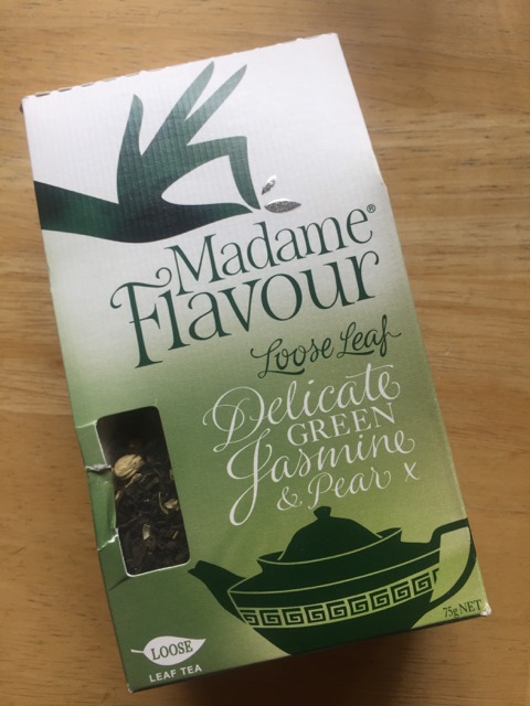
 Here is another one of Madame Flavour's unique blends - Delicate Green Jasmine & Pear.
Open the package and just inhale the fruity flowery jasmine fragrance. Do watch the kettle when you are boiling the water to keep the green tea from becoming bitter - you can always add a splash of cold water to keep the temperature to about 80-85 degrees F. The first cup I brewed for 3 minutes, next time 2 minutes. It doesn't need any thing else to bring out the flavor - it's wonderful as it is.
Rating: 4 1/2, especially if you love green tea.

 |
| LOVE these heart infusers from Phoenicia Foods in downtown Houston! |
Wednesday, January 25, 2017
Wednesday Work in Progress - LemonAid
When a still life hands you a lemon - practice crazy painting them! There is something quite freeing when all hope is lost. #whattheheck #justslopthepainton #painteveryday #lemonaid

 Some times things don't turn out as planned. But you know, when this particular painting morphed to overworked, it was time to try different suggestions and techniques - resulting in a rather mishmash, and layers of them. I'm cool with that. I learn and have fun with my "detours," I prefer not to call them mistakes.


Tuesday, January 24, 2017
30 Paintings in 30 Days - Color Wheel Fun "Well Red"
 |
| Matthew 5: 1-12 "The mountain to be climbed is love" - Robert DeLeon, CSC |
Analogous landscape trees - watercolor color wheel fun. I painted from a black and white photograph using a DIY red value finder using red clear plastic/acetate/gel/film and a mat. It really helped to do my checks along the way. (picture to be posted in a bit)
Monday, January 23, 2017
Part 20 of Adventures with Brusho
Hobby Lobby also had on clearance for 54 cents the tear-dropped shapes in the Blank Slate by Traditions. I thought they looked like lotus petals, and then I thought, perhaps paint them in chakra colors!

I tried to arrange them like a lotus --


 |
| Love how the Gray Brusho looks like a diamond! |


Most likely I will incorporate them individually in mixed media journal pages and/or paintings.
Sunday, January 22, 2017
30 Paintings in 30 Days & Sunday Funday

"Roll with it" Rerolled bag of kolaches, two watercolor sketches in one. The dangers of painting and sketching at the kitchen table on a Sunday afternoon and the same time fending off the hands and the Q & A "Is this the bag of kolaches?"
I also tried Angela Fehr's idea of "Palette Mud" - using the leftover colors in my palette from a previous painting for the shading/values.
And I put a new Art Graf water-soluble Carbon Intense Black disc ($2.89 from the Hobby Lobby clearance section) through its paces to sketch and practice line/contour drawing a la Charles Reid.

I thought it was fun (and the kolaches were delicious!)
Update 1-23-17 - The other sketchbook paintings from yesterday...much easier to photograph in the morning sun than indoor lighting.
 |
| House of Pies Chocolate Cream pie! |
 |
| Practicing painting people! And I enjoyed a delicious Caramel Macchiato! |
Thursday, January 19, 2017
Thursday Tea Time - Did you say more tea, eh? I said Yay!
If you don't have a David's Tea in your city, find someone who does or take a trip! They have the most delicious and unusual tea flavors and combinations, including (genius!) tea-infused truffles (photo not available of those, as I carefully rationed myself to 1 or 2 per day, and well...)
Let's see -- Miami 1,188...Chicago 1,082 miles. . .
Apple Cider!


 Coffee Cake!

Nutty and Spice!
It's probably a good thing the closest David's Tea is over 1,000 miles away. But then again, there is online ordering...and sales! All three of these are currently on sale - I may need to restock. Another bonus is that these teas are so good and flavorful, you don't need to add anything to them. Move over Teavana, there's a new guy in (out of) town. I could do a long distance relationship.
Let's see -- Miami 1,188...Chicago 1,082 miles. . .


 |
| The golden Perfect spoon is also from David's Tea No more spilled tea! |

Nutty and Spice!
 |
| I wish they made a candle of this crazy good scent! |
 |
| Nutty color! |
30 Paintings in 30 Days - Day 19 -- Part 19 of Adventures with Brusho -- The Daffiness continues
OK, so this time I thought I would actually "paint" with Brusho using a paintbrush. All the splatter and shave cream and abstract attempts aside.
I used three types of paper with varying results as you will see. I finished each with a spritz of the Brusho metallic acrylic in Shimmer Yellow. Each time I painted the daffodil first.
The best result was with Arches 140# cold press
The Shimmer spray spread a little, yet retained the metallic effect, more visibly when tilting towards light.
I liked how all the colors (yellow, lemon yellow orange, blue, brown) blended in the petals, but I felt it was more a lucky coincidence. You don't really get a second chance with Brusho once you lay the color down, especially on a grabby surface. I kept dropping in color, blending (trying) and hoping for the best. I thought it made a nice shadow, but with more pigment on the brush I had difficulty softening the edges of the vase. I was able to dip my brush in my water jar and add effects inside.
Runner up - Strathmore Bristol Smooth
I thought the Shimmer spray worked the best with this surface
Somehow my brush picked up airborne brown and green in the yellows cup sections. Not quite the daffodil yellow I was going for. Easy to get softer edges on the vase, but again, not much lifting.
While Yupo does great with the splashing in previous examples, it was like herding kittens trying to control placement with a paintbrush. It was also difficult to get darker values. I don't recommend painting directly with Brusho on Yupo unless you have a good bad vocabulary. Hard edges, paint rolling down, going where I didn't want it to go...argh.
The Shimmer spray also activated the airborne invisible Brusho crystals. I tried to blot them.
Keeping it real here, readers.
I still believe that if you have an open mind to an open result, Brusho can be interesting to paint with. And the patience and countenance of a saint. I will reiterate that if you are into card making, journal pages, abstract - Brusho will become your bestest painting buddy.
In the meantime, I have a group date with Daniel and Newton along with my honey, Gustave, later on.
I used three types of paper with varying results as you will see. I finished each with a spritz of the Brusho metallic acrylic in Shimmer Yellow. Each time I painted the daffodil first.
 |
| Arches watercolor paper 140# |
The best result was with Arches 140# cold press
The Shimmer spray spread a little, yet retained the metallic effect, more visibly when tilting towards light.
I liked how all the colors (yellow, lemon yellow orange, blue, brown) blended in the petals, but I felt it was more a lucky coincidence. You don't really get a second chance with Brusho once you lay the color down, especially on a grabby surface. I kept dropping in color, blending (trying) and hoping for the best. I thought it made a nice shadow, but with more pigment on the brush I had difficulty softening the edges of the vase. I was able to dip my brush in my water jar and add effects inside.
 |
| Bristol Smooth |
I thought the Shimmer spray worked the best with this surface
Somehow my brush picked up airborne brown and green in the yellows cup sections. Not quite the daffodil yellow I was going for. Easy to get softer edges on the vase, but again, not much lifting.
 |
| "Exploding Daffodil" What in the name of Sam Hill?! |
The Shimmer spray also activated the airborne invisible Brusho crystals. I tried to blot them.
Keeping it real here, readers.
I still believe that if you have an open mind to an open result, Brusho can be interesting to paint with. And the patience and countenance of a saint. I will reiterate that if you are into card making, journal pages, abstract - Brusho will become your bestest painting buddy.
In the meantime, I have a group date with Daniel and Newton along with my honey, Gustave, later on.
Wednesday, January 18, 2017
30 Paintings 30 Days - Day 18 - Daffy
 |
| YAS! |
 | |
Whoops, vase disappeared. Patience lesson #84921
|
 |
| Liking the iridescent vase look, background still a little too wet |
 |
| Love the background. and the whatever you call the part of the daffodil center edges. Corona! |
Tuesday, January 17, 2017
30 Days 30 Paintings - Day 17 - Practice, practice, practice, practice
 |
| I like the leaves on this one - I had actually reached the point I was just slapping and throwing paint on the left |
 |
| I can see why people are nuts over Sennelier yellows! |
 |
| This one. . .lol a reminder not to take yourself so seriously and laugh |
 |
| Good example of just letting the colors run and play |
I attended a Paint-In on Saturday to learn skills, tips and techniques working in wet-in-wet. I couldn't wait for Hobby Lobby to open yesterday to buy a piece of plexiglass and put my new Sennelier half pan palette through its paces. (They are all 10" x 8") And I will paint eight more this afternoon with another another palette. And then another. And another. By the time I work through them all, I should have eleventy-billion sunflowers and a better grasp of this technique. Each painting so far I've learned and loved something about it. There is certainly a lot of freedom and fun just practicing and playing. #NoFear #SunflowersTheSeries #BuyMorePaper
Monday, January 16, 2017
Adventures with Brusho - Part Eighteen - Gray-Diations of ice and Winter
I am loving the Brusho in Gray or Grey! I feel it is more green/indigo/orange/red than Black. And it plays nicely with a few sprinkles of Purple.
Here again I used Gillette Foamy shaving cream and Strathmore Bristol Smooth, 11" x 14". This time I scraped off with an index card what was left of the shaving cream peaks on the original print - most had "puffed" off and little remained.
Master print
This was the first/master print. The thicker squiggles of shaving cream acted like a soft resist. Most of the shaving cream "poofed" off as it dried. Unlike on watercolor paper, it didn't stick around. You can see where I did push off some of the areas with an index card. Good to know you can "etch" and scrape a little for additional texture.
Secondary print
Third print (with a few more shakes of gray and purple and a little spritz of water
I think it looks frosty icy
Fourth print - I wet this again with water and wadded/crumpled it up good. (Who hasn't thought of doing this to their Brusho painting?!) Actually the Bristol Smooth did smooth out a little. I like the random creases and texture from the paper. I will try this technique again with more wet paint. However with this color pigment, I think it looks like ice or frost with less paint.
Here are the close ups --
Here again I used Gillette Foamy shaving cream and Strathmore Bristol Smooth, 11" x 14". This time I scraped off with an index card what was left of the shaving cream peaks on the original print - most had "puffed" off and little remained.
Master print
 |
| Original |
This was the first/master print. The thicker squiggles of shaving cream acted like a soft resist. Most of the shaving cream "poofed" off as it dried. Unlike on watercolor paper, it didn't stick around. You can see where I did push off some of the areas with an index card. Good to know you can "etch" and scrape a little for additional texture.
Secondary print
 |
| Second printing |
Third print (with a few more shakes of gray and purple and a little spritz of water
I think it looks frosty icy
 |
| Third printing |
Fourth print - I wet this again with water and wadded/crumpled it up good. (Who hasn't thought of doing this to their Brusho painting?!) Actually the Bristol Smooth did smooth out a little. I like the random creases and texture from the paper. I will try this technique again with more wet paint. However with this color pigment, I think it looks like ice or frost with less paint.
 |
| Fourth and crumpled |
Here are the close ups --
 |
| Original master print |
 |
| Second print |
 |
| Third print |
 |
| Fourth and crumpled |
Sunday, January 15, 2017
30 Paintings 30 Days - Day 15
 |
| "Mountain view on the way to Galveston" |
 |
| Cropped! |
Three colors -- I used Winsor & Newton Indigo for the sky and water reflection, Daniel Smith's Quinacridone Gold and Olive Green.
 |
| Snow Trees |
I liked the shadowy effect in the background and then when it dried, using the rigger brush to make the trees creating my own black and my Daniel Smith Lunar Black.
 |
| Path of light |
This was so much fun - wet in wet Daniel Smith's Undersea Green separates into Ultramarine blue and yellow and pushes into the treeline of Winsor & Newton French Ultramarine Blue. The sky is a mix of Winsor & Newton Alizarin Crimson and French Ultramarine Blue. I mixed the two together and then double-loaded the brush edges of each separate color I added a few touches of Alizarin to the green for more fun color play.
Wednesday, January 11, 2017
30 Paintings 30 Days - Day 11
 |
| 9" x 6" |
What my favorite yoga teacher always closes with after Savasana. And how I felt this morning after yoga and after painting this.
Tuesday, January 10, 2017
30 Paintings 30 Days - Day 10 -- Part 17 of Adventures with Brusho
 |
| 9" x 6" |
Monday, January 09, 2017
30 Paintings 30 Days - Day 9
 |
| 7 1/2" x 13 1/2" |
I'm also doing preplanning in my sketchbook first -
 |
| I love this sketchbook for my watercolor classes. It was actually recommended by my drawing teacher. It's a good size, it has lots of pages And it can take water media experimentation without protest It is the perfect classwork/workshop workbook sketchbook for me I found this particular size on Amazon, but support and check your local art supply stores first! |
 |
| Also a reminder to "box it in" draw a line around the composition to "see" the painting I liked the size and shape of this |
I also like to put all those stickers we get in the mail, on fruit, in the stores, souvenirs, etc. on my sketchbooks. One of the Craftsy instructors does that and I thought that was a cool idea. Makes your sketchbook unique and easy for you (and others) to find, and honestly, how often do we collect these stickers and just stick in a drawer and forget. Use and enjoy them!
Subscribe to:
Posts (Atom)