I love daffodils - they are my birth month flower and we can grow them in Texas. I did two sets of three - Each one turned out differently.
On Aquabee watercolor paper, I traced my sketch and sprayed Colourcraft Acrylic spray in Yellow Shimmer. Using Lemon, Yellow, Orange, Emerald and Leaf Green Brusho and a small dry brush, I covered the lines of the daffodil. Then I added water with a larger wet brush. It needed a little more looseness, so when it was almost dry, I spritzed a little more water to create some movement from the remaining crystals.
Showing posts with label Brusho. Show all posts
Thursday, March 09, 2017
Monday, January 23, 2017
Part 20 of Adventures with Brusho
Hobby Lobby also had on clearance for 54 cents the tear-dropped shapes in the Blank Slate by Traditions. I thought they looked like lotus petals, and then I thought, perhaps paint them in chakra colors!
I tried to arrange them like a lotus --
![]() |
| Love how the Gray Brusho looks like a diamond! |
Most likely I will incorporate them individually in mixed media journal pages and/or paintings.
Thursday, January 19, 2017
30 Paintings in 30 Days - Day 19 -- Part 19 of Adventures with Brusho -- The Daffiness continues
OK, so this time I thought I would actually "paint" with Brusho using a paintbrush. All the splatter and shave cream and abstract attempts aside.
I used three types of paper with varying results as you will see. I finished each with a spritz of the Brusho metallic acrylic in Shimmer Yellow. Each time I painted the daffodil first.
The best result was with Arches 140# cold press
The Shimmer spray spread a little, yet retained the metallic effect, more visibly when tilting towards light.
I liked how all the colors (yellow, lemon yellow orange, blue, brown) blended in the petals, but I felt it was more a lucky coincidence. You don't really get a second chance with Brusho once you lay the color down, especially on a grabby surface. I kept dropping in color, blending (trying) and hoping for the best. I thought it made a nice shadow, but with more pigment on the brush I had difficulty softening the edges of the vase. I was able to dip my brush in my water jar and add effects inside.
Runner up - Strathmore Bristol Smooth
I thought the Shimmer spray worked the best with this surface
Somehow my brush picked up airborne brown and green in the yellows cup sections. Not quite the daffodil yellow I was going for. Easy to get softer edges on the vase, but again, not much lifting.
While Yupo does great with the splashing in previous examples, it was like herding kittens trying to control placement with a paintbrush. It was also difficult to get darker values. I don't recommend painting directly with Brusho on Yupo unless you have a good bad vocabulary. Hard edges, paint rolling down, going where I didn't want it to go...argh.
The Shimmer spray also activated the airborne invisible Brusho crystals. I tried to blot them.
Keeping it real here, readers.
I still believe that if you have an open mind to an open result, Brusho can be interesting to paint with. And the patience and countenance of a saint. I will reiterate that if you are into card making, journal pages, abstract - Brusho will become your bestest painting buddy.
In the meantime, I have a group date with Daniel and Newton along with my honey, Gustave, later on.
I used three types of paper with varying results as you will see. I finished each with a spritz of the Brusho metallic acrylic in Shimmer Yellow. Each time I painted the daffodil first.
![]() |
| Arches watercolor paper 140# |
The best result was with Arches 140# cold press
The Shimmer spray spread a little, yet retained the metallic effect, more visibly when tilting towards light.
I liked how all the colors (yellow, lemon yellow orange, blue, brown) blended in the petals, but I felt it was more a lucky coincidence. You don't really get a second chance with Brusho once you lay the color down, especially on a grabby surface. I kept dropping in color, blending (trying) and hoping for the best. I thought it made a nice shadow, but with more pigment on the brush I had difficulty softening the edges of the vase. I was able to dip my brush in my water jar and add effects inside.
![]() |
| Bristol Smooth |
I thought the Shimmer spray worked the best with this surface
Somehow my brush picked up airborne brown and green in the yellows cup sections. Not quite the daffodil yellow I was going for. Easy to get softer edges on the vase, but again, not much lifting.
![]() |
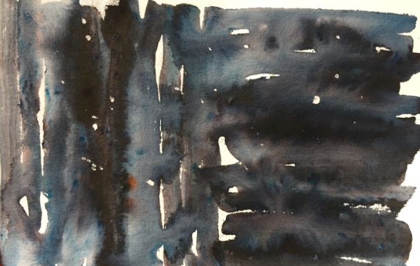
| "Exploding Daffodil" What in the name of Sam Hill?! |
The Shimmer spray also activated the airborne invisible Brusho crystals. I tried to blot them.
Keeping it real here, readers.
I still believe that if you have an open mind to an open result, Brusho can be interesting to paint with. And the patience and countenance of a saint. I will reiterate that if you are into card making, journal pages, abstract - Brusho will become your bestest painting buddy.
In the meantime, I have a group date with Daniel and Newton along with my honey, Gustave, later on.
Monday, January 16, 2017
Adventures with Brusho - Part Eighteen - Gray-Diations of ice and Winter
I am loving the Brusho in Gray or Grey! I feel it is more green/indigo/orange/red than Black. And it plays nicely with a few sprinkles of Purple.
Here again I used Gillette Foamy shaving cream and Strathmore Bristol Smooth, 11" x 14". This time I scraped off with an index card what was left of the shaving cream peaks on the original print - most had "puffed" off and little remained.
Master print
This was the first/master print. The thicker squiggles of shaving cream acted like a soft resist. Most of the shaving cream "poofed" off as it dried. Unlike on watercolor paper, it didn't stick around. You can see where I did push off some of the areas with an index card. Good to know you can "etch" and scrape a little for additional texture.
Secondary print
Third print (with a few more shakes of gray and purple and a little spritz of water
I think it looks frosty icy
Fourth print - I wet this again with water and wadded/crumpled it up good. (Who hasn't thought of doing this to their Brusho painting?!) Actually the Bristol Smooth did smooth out a little. I like the random creases and texture from the paper. I will try this technique again with more wet paint. However with this color pigment, I think it looks like ice or frost with less paint.
Here are the close ups --
Here again I used Gillette Foamy shaving cream and Strathmore Bristol Smooth, 11" x 14". This time I scraped off with an index card what was left of the shaving cream peaks on the original print - most had "puffed" off and little remained.
Master print
![]() |
| Original |
This was the first/master print. The thicker squiggles of shaving cream acted like a soft resist. Most of the shaving cream "poofed" off as it dried. Unlike on watercolor paper, it didn't stick around. You can see where I did push off some of the areas with an index card. Good to know you can "etch" and scrape a little for additional texture.
Secondary print
![]() |
| Second printing |
Third print (with a few more shakes of gray and purple and a little spritz of water
I think it looks frosty icy
![]() |
| Third printing |
Fourth print - I wet this again with water and wadded/crumpled it up good. (Who hasn't thought of doing this to their Brusho painting?!) Actually the Bristol Smooth did smooth out a little. I like the random creases and texture from the paper. I will try this technique again with more wet paint. However with this color pigment, I think it looks like ice or frost with less paint.
![]() |
| Fourth and crumpled |
Here are the close ups --
![]() |
| Original master print |
![]() |
| Second print |
![]() |
| Third print |
![]() |
| Fourth and crumpled |
Tuesday, January 10, 2017
30 Paintings 30 Days - Day 10 -- Part 17 of Adventures with Brusho
Sunday, January 08, 2017
30 Paintings 30 Days - Day 8 --- and Part 16 of Adventures with Brusho
You are probably saying, "but I haven't seen eight paintings?!" However, some of the previously posted Brusho ones I counted.
And here are three more. I watched Sandy Allnock's "Watercolor Flower Series #11: Paint a Brusho Garden" She had good advice and made it look easy. I highly recommend checking out her other videos on her channel.
I tried three times with these, with varying results. Part could be perhaps the paper was too "grabby" with the Brusho and I could not dissolve the pigments fast enough, despite sprinkling and quickly trying to blend onto already wet paper. Some of them were more staining and less movable/forgiving. Or they dissolved too much and I couldn't achieve enough value/contrast to make the petals pop. With the last one, you can sense my frustration as I gave up and just randomly shook the canisters, sprayed more water on top and wadded up Saran Wrap and walked away. I hardly think that is painting per se. While watercoloring is unpredictable as a rule, Brusho can be fun, but off the charts random. I think some of my best pieces over the past few weeks were my "mistakes" or "what the _ell" moments.
On the positives -- I discovered Brusho plays beautifully with Yupo paper. If you want to make pretty backgrounds for cards and journals, another point in Brusho's favor. Leading a Girl Scout troop or camp art activity - they would love this! Especially with the different options of using shaving cream to make "prints" and spray starch to disperse the colors.
However, in trying to paint-paint, I think the pigments are too random and hard to control, at least for me at this point in the Brusho learning curve. I have difficulty with the colors, even with twelve, to achieve darker values. They can be staining and unforgiving.
I would still definitely recommend buying a few colors and playing around with them. There are lots of videos/YouTubes, Facebook groups and blogs available with good advice and tips. I hope some of my posts were helpful in showcasing my Brusho journey in discovering what it could/could not do for me.
And here are three more. I watched Sandy Allnock's "Watercolor Flower Series #11: Paint a Brusho Garden" She had good advice and made it look easy. I highly recommend checking out her other videos on her channel.
I tried three times with these, with varying results. Part could be perhaps the paper was too "grabby" with the Brusho and I could not dissolve the pigments fast enough, despite sprinkling and quickly trying to blend onto already wet paper. Some of them were more staining and less movable/forgiving. Or they dissolved too much and I couldn't achieve enough value/contrast to make the petals pop. With the last one, you can sense my frustration as I gave up and just randomly shook the canisters, sprayed more water on top and wadded up Saran Wrap and walked away. I hardly think that is painting per se. While watercoloring is unpredictable as a rule, Brusho can be fun, but off the charts random. I think some of my best pieces over the past few weeks were my "mistakes" or "what the _ell" moments.
![]() |
| Too pale and blended - added extra Scarlet strokes Frustrated by the Leaf and Emerald Greens attaching/attacking the paper and not letting go |
![]() |
| I couldn't get the greens darker or blend again, so I sprinkled Brown over it! A little bit better control with the rose, though |
![]() |
| I still couldn't achieve more value in the rose I wanted. I even sprinkled Brown in it - not a good move in hindsight. |
However, in trying to paint-paint, I think the pigments are too random and hard to control, at least for me at this point in the Brusho learning curve. I have difficulty with the colors, even with twelve, to achieve darker values. They can be staining and unforgiving.
I would still definitely recommend buying a few colors and playing around with them. There are lots of videos/YouTubes, Facebook groups and blogs available with good advice and tips. I hope some of my posts were helpful in showcasing my Brusho journey in discovering what it could/could not do for me.
Monday, January 02, 2017
Adventures with Brusho - Part Fifteen - Stop and Stencil
Alcohol can stop the pigment movement on previously Brusho'd paper. In this example, I used water and Brusho on watercolor paper. When I decided to add another round/shake of Brusho in Blue and then spritzed alcohol on it - it did not blend. Instead it created a slight movement and quickly halted dotted effect.
![]() |
| You can really see the different pigments of the Brown separate and do their thing |
Using Brusho on Bristol Vellum Artist Tiles with a stencil created a pretty effect. I placed the stencil on the paper, shook Brown Brusho all over and then sprayed with water.
The second one was a print with the remaining wet Brusho on top of the stencil. I flipped the stencil onto the paper face down and removed it. I then sprinkled Ultramarine to the top of the print and added more water. I liked how the colors ran together.
Sunday, January 01, 2017
30 Paintings 30 Days - Day 1
![]() |
| Galveston Seawall - West End Christmas 2016 |
This was painted from a photograph of my husband and daughter walking toward the West end of the Galveston Seawall Christmas Day afternoon. It really was that foggy! The light from the sun made a nice contrast.
Working wet in wet on 9" x 6" Aquabee watercolor paper. I used the Black Brusho, which when mixed with water completely, kind of turns Payne's Gray, with occasional bits of blue.
Here's a look when left to its own devices/separated pigments.
![]() |
| Brusho - Black |
Saturday, December 31, 2016
Adventures with Brusho - Part Fourteen - "Fade to Black"
Here's all the fun I had playing with Brusho Black --
Look at all the colors! Sprinkled with the shaker and spritzed with water.
Trying to do a wash -- I thought the left side, which was done with dipping a wet brush into loose crystals on dry paper, shaded nicely and kept more of the pigment. I wet the paper first on the right side and then used the wet brush/crystals, turning it into shades of gray.
So I thought...maybe this would make a nice background for a night sky? Only make it darker. I would add some masking fluid for stars.
Not quite the look I anticipated! Pretty however. I did not wet the paper this time and was careful not to overmix on the paper to avoid graying.
I do love Brusho and Saran Wrap, and I am still favoring using this technique with the Bristol paper over the watercolor paper for my defined edges and color.
And now what is turning into my favorite Brusho effects - making prints!
I still use the watercolor paper as the base, really going overboard with sprinkle and spritz.
This is what's left
The Bristol paper makes great prints - this is the artist tile size
As a point of comparison, here is my workout with Brusho in Gray/Grey.
Look at all the colors! Sprinkled with the shaker and spritzed with water.
Trying to do a wash -- I thought the left side, which was done with dipping a wet brush into loose crystals on dry paper, shaded nicely and kept more of the pigment. I wet the paper first on the right side and then used the wet brush/crystals, turning it into shades of gray.
So I thought...maybe this would make a nice background for a night sky? Only make it darker. I would add some masking fluid for stars.
![]() |
| Umm. |
I do love Brusho and Saran Wrap, and I am still favoring using this technique with the Bristol paper over the watercolor paper for my defined edges and color.
![]() |
| Saran Wrap on Aquabee watercolor paper |
![]() |
| Saran Wrap on Bristol paper |
I still use the watercolor paper as the base, really going overboard with sprinkle and spritz.
This is what's left
![]() |
| watercolor paper at the end of printing |
The Bristol paper makes great prints - this is the artist tile size
As a point of comparison, here is my workout with Brusho in Gray/Grey.
Friday, December 30, 2016
Adventures with Brusho - Part Thirteen - "In a lather"
You can mix Brusho with shaving cream for a dimensional effect and to use in making prints. I found using watercolor paper as the base and using Bristol Vellum to make "prints" worked well.
The shaving cream fragrance will dissipate after awhile. I used Gillette Foamy.
Center upper is the base watercolor paper
The purple series. . .
And what you are left with (the watercolor paper) is pretty, too!
The shaving cream fragrance will dissipate after awhile. I used Gillette Foamy.
Center upper is the base watercolor paper
The purple series. . .
And what you are left with (the watercolor paper) is pretty, too!
Thursday, December 29, 2016
Adventures with Brusho - Part Twelve - "Sanitized and Germ-Free"
Brusho on Yupo with alcohol spray - love this effect!
First I sprinkled Brusho and then sprayed a little bit of water. I went to my garden and picked geranium (on the left) and plumbago (the right) blossoms and placed on the paper. A few spritzes from the alcohol sprayer made for a pretty floral effect.
Brusho on Yupo paper, spray with rubbing alcohol and then when it is almost dry, add a few light spritzes of alcohol.
Our local grocery store, Kroger, has their store brand of alcohol already in a sprayer. Convenient and refillable and ready to play and spray.
Wednesday, December 28, 2016
Watercolor Wednesday - Adventures with Brusho - Part Eleven - "Playing with Fire"
A friend in one of the Brusho Facebook groups suggested using Brusho and Saran Wrap to make "fire"
I am still experimenting with different papers - but this time I am favoring the watercolor paper and the Brusho/Saran Wrap combo slightly over the Bristol.
I used Lemon, Yellow, Scarlet and Brilliant Red. With a few dashes of Orange for good measure.
I am still experimenting with different papers - but this time I am favoring the watercolor paper and the Brusho/Saran Wrap combo slightly over the Bristol.
![]() |
| Aquabee Watercolor paper Brusho Saran Wrap |
![]() |
| Strathmore Bristol paper Brusho Saran Wrap |
Subscribe to:
Comments (Atom)


