Showing posts with label Wednesday Work In Progress. Show all posts

Wednesday, January 25, 2017

Wednesday Work in Progress - LemonAid

When a still life hands you a lemon - practice crazy painting them! There is something quite freeing when all hope is lost. #whattheheck #justslopthepainton #painteveryday #lemonaid


Some times things don't turn out as planned.  But you know, when this particular painting morphed to overworked, it was time to try different suggestions and techniques - resulting in a rather mishmash, and layers of them.  I'm cool with that.   I learn and have fun with my "detours," I prefer not to call them mistakes.

Wednesday, January 18, 2017

30 Paintings 30 Days - Day 18 - Daffy

YAS!
Plexiglass, practice and progress all go together!  And you actually try it yourself and figure it out yourself - I thought all four of these show and tell the story.  Minus the *colorful* soundtrack (lol-  #*@%!!)  I went to Texas Art Supply yesterday to get the Daniel Smith paints Nancy used and suggested to make the background - Indanthrone Blue, Anthaquinoid Red.  The only other colors were Quin Gold (WN, the single pigment DS is on my list) and Sennelier Naples Yellow Deep and Lemon Yellow from my half pan palette.

Whoops, vase disappeared. Patience lesson #84921
Liking the iridescent vase look, background still a little too wet

Love the background. and the whatever you call the part of the daffodil center edges.
Corona!

Wednesday, October 26, 2016

How do you like them apples? Part 2

And here is a view of the branches of an autumn crabapple tree in Santa Fe, New Mexico.
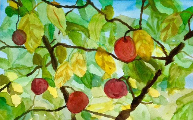
Autumn Santa Fe Crabapple Tree
Watercolor
12" x 18 1/2"
This was fun skill-building and patience-building to paint.  First a wash of Winsor-Newton Blue (Green), then layers of Auerolin and more yellows, mixing greens, Alizarin for the apples with more glazing of additional reds, and finally, finally the sepia, burnt umber, cobalt blue to create warm branches.  I had to redraw my branches figuratively and creatively, for I was having too much fun making all the different leaves and leaf shapes and background.

I also gave myself points for painting bigger -- this is 12" x 18 1/2"

I really like how the variety of colors played nicely together,  pushed forward and back, and the assortment of shapes.

My paper is  always up and ready for another pitch - of paint with brush in hand.


How do you like them apples?

An apple a day helps improve your watercolor skills!  Having fun practicing working wet in wet, and glazes, and the elusive shadows.  I actually painted them actual size!


Wednesday, October 12, 2016

“Faites des lignes. Faites beaucoup de lignes.”

Inspired by Picasso The Line exhibition (through January 8, 2017) at The Menil in Houston and Imagining Backwards:  Seven Decades of Picasso Master Prints McClain Gallery (through October 29), our classwork including doing line drawings, learning to make our own mark.  Trying to make a continuous line using different marking techniques and not looking at the paper, was an interesting exercise.  In fact, I've used one of my drawings twice as cards to send to friends for birthday and get well by adding watercolor.

Here was my first attempt in class --


Kangaroos feeding in the Australian Bush
India Ink and stick, charcoal, graphite, Conte crayon


Then a few days later, I woke up at 3:44 AM, went out to the kitchen table, grabbed my sketchbook and started drawing a slightly wilted vase of sunflowers in front of me.  Each variation I started my line at a different place on the paper, as indicated by the arrow.   I even tried drawing with my left (non-dominant) hand!

(I did look while drawing this)
Perhaps I can draw better left-handed?!


Outlined with Micron pen


Using Tombow 977 Saddle Brown
over graphite tracing from
Enlarged copy of first drawing


________
Jean-Auguste-Dominique Ingres - 1780 – 14 January 1867) French Neoclassical painter. 
(This was his advice to a young Degas who had announced he wanted to become a painter)

Wednesday, September 28, 2016

Watercolor Wednesday - Abstract Thinking of Zen

Inspired by William Tillyer and Peter M. Hicks, working in abstract.  Washes of similar values with an added shape of opaque color.  Keeping an open mind and an open heart, I painted four pieces, at least I was having fun mixing colors.
10" x 14 1/4"

10" x 14"

10 1/4" x 14 1/4"
I even added a wash of Ivory Black Casein on this one, "Gray-dients"
It kept it from looking too "precious," but still needed something to save it from the card-making bin.
"Gray-dients"
8" x 14 1/2"
After watching "Inspired Landscape" on YouTube and Google-gazing, I decided to add a pop of color to two of my paintings.  I spun the color wheel around and loaded up my largest round brush with a lilac gouache and made Zen ensō circles.


In Zen Buddhism,  the ensō brushstroke expresses that moment when the mind is free to let the body create.   A symbol of wholeness and completion, my paintings were finished.

"Within the spinning circle of life we are born.
The human heart too should always be kept
round and complete."
~ Nantembo (1839-1925)

Wednesday, September 14, 2016

Wednesday Watercolor - When Still Life Gives You a Lemon

"When Still Life Gives You a Lemon"
10 1/4" x 11 1/2"
Just like practicing the scales, a still life painting gets the creaks out and provides opportunity to practice and play around with brushwork, interpretation and problem solve.

I think the best take-away from this was creating the shadow of the lemon - not by glazing over the background, but by cooling and dulling the colors the shadow would cast.  You can also see that in the lower right hand corner stripes.

And remembering to wet the dark areas first before adding and glazing more layers.  I liked how velvety the black turned out.  Perhaps painting first the "oops, what was I thinking Lunar Black?!" helped.

I also liked curving the lemon reflecting in the jar.  (Using that Artistic license)

And really trying to work bigger, more wet-in-wet and looser.

We are all developing our own style and then pushing to expand.  Each of us in class had their own interpretation and it was fun to see their perspective.

Will this be sent off the framer - no, entered into completion - no, sold? - Make an offer  ; )
Will it be kept to see how far I've progressed and to help remember techniques?  Yes.

The learning is in the doing.

Wednesday, September 07, 2016

Watercolor Wednesday - Chillin' at 72 degrees

Chilllin' at 72 degrees
10" x 8 1/2"
watercolor
Playing with my Strathmore 300 Series watercolor paper, trying to get those darker values. . .
This is a Chacos feetside view of the Texas Wild Rice (Zizania texana) in the year-round 72 degree San Marcos River.

Wednesday, August 31, 2016

“Often a purple patch or two is tacked on to a serious work of high promise..." Horace

Test strips of my purples and violets --


Qor Doxazine Purple
This one seems more of a blue purple to me.

Daniel Smith Carbazole Violet
I actually liked this one the best

Winsor & Newton Winsor Violet Doxazine
Very intense deep purple leaning towards red.


Winsor & Newton Caput Mortum Violet
PR 101, Iron Oxide
Kind of a fun color, love all the shades and its lifting ability

Holbein Mars Violet
PR 101, PV 22, PBr 7 (Iron oxide)
A lot people sing this one's praises

American Journey Raw Umber Violet
PBr 7 (Iron Oxide), PV 19
This looks like a versatile color, too.

Wednesday, August 17, 2016

Take it with a grain of salt

or a handful. . .

In Open Studios, we were watching Judy Morris' DVD, "Tuscan Textures," and playing with her techniques using salt in our watercolors.   She had some good tips -- hold the salt 10" above the painting and only work with an area of wet watercolor the size of your palm.  Timing is also important, and paper for a variety of effects.  Once it is completely dry, use a credit card or palette knife to scrape off the salt.  I had always used my fingers...you will get more texture and better results scraping rather than brushing/rubbing.

You definitely need to play around with your paints beforehand - the pigments will interact differently depending upon transparency.  I will post a picture of my India Ink stripe to demonstrate opaqueness later.  Even if it is the same color, some brands will have varying results.

The types of salt will give different results.  Table salt (she prefers non-iodized), Kosher salt, pretzel salt...I was playing with Pink Himalayan salt from the 99 Cent Store


and I really liked what it did here --

Before I removed the Himalayan pink salt - it has to be completely dry
Patience!
I carried it home on a rimmed aluminum cookie sheet - Also found at the 99 cent store!

Is that not cool or what?!

This was French Ultramarine dropped into Winsor Green and Winsor Red
Look how the salt pulled and mixed the colors
It was almost black before adding the French Ultramarine and salt


"After" photo of Cerulean and Indian Red dropped into each other
Interesting color combination and reaction!
Table salt - I thought this was trickier to use
You have to time it just right with the dampness or else you will
get "stars"
And granted this was also watercolor sketchbook paper -
not the highest quality


The next time I was at the grocery store, I picked up Margarita salt.  I even saw Bacon Salt.

Isn't everything better with bacon, including watercoloring?  I bet those effects would be really cool on lighter colored washes!

This is definitely an exercise and reminder to experiment and have fun.  Different colors/pigments will react differently to different salts and at different times and different amounts of water on the paper.  The fun and unexpectedness of watercolor!

Wednesday, July 20, 2016

Pressed for Purple

"Lori's Purple Oxalis"
5 1/2" x 4"
"Lori's Purple Oxalis" - watercolor on hand dyed watercolor paper, impressioned while still wet with the top of a plastic to-go drink lid.

‪#‎WorldWatercolorMonth‬

Wednesday, June 22, 2016

Impasto-ble!

Tube Paste
Discontinued, so half off Texas Art Supply's already discounted prices
Odd size, but easy to work with in the pad format and then cut down afterwards 
Kicked myself all the way home to Texas my first visit to Australia when I didn't get this
- made a beeline back to Bondi Art Supply the day I arrived and grabbed it
Got the gum arabic, the paper and the pigment.  All set for play time!

Wednesday, June 15, 2016

The Ol' Collage Try

Fun to try experience,  I like how the hearts turned out and may use them in other ways or add to them.  Is it my thing?  Hmmm, probably not.  (There were others in the class who took the pieces and glue, and did amazing work.)  I did learn about Yes! paste - new toys and tools are always good to add to my collection.  And of course, the experience of having a great time in class with my fellow art peeps.


Let Eco My Heart
5 3/4" x 5 1/4"

Tent Green
5" x 4 1/2"

Grounded Upwards
8" x 5 1/2"


Wednesday, June 08, 2016

Who turned on the light?

Last class until the fall, we were practicing turning on the light without having to resort to a surrounding dark value.   I'm getting over my fear of shadows and trying to be more loose.  I also like the brass and glass picture frame reflections.  A fun classwork project!

7 1/4" x 8"

Wednesday, February 10, 2016

Watercolor Wednesday - I'm all about that sketch, no pencil

Monarch butterfly on milkweed plant
ink and watercolor sketch
5 3/4" x 6 1/2"


First attempts at sketching with pen and ink and watercolor - without using pencil (and eraser!) first.
Brown toned paper.  I used Dr. Ph. Martin's Bombay White India Ink for the highlights. I liked it better than gouache, surprisingly it held the white better after drying.

Monarch butterfly on milkweed plant sketch
watercolor, pen and ink
5 1/2 x 6"
It was fun experimenting with and comparing the different pens and markers I've collected along the way. . .some dried quickly, other areas I could blend with a wet brush.  I will add a page to my sketchbook so I can remember which did what, and my favorites.

Wednesday, February 03, 2016

Watercolor Wednesday - Get the white out!

Eggs in Green Glass Bowl
watercolor
9 1/2" x 10"
Class project piece, learning (playing) different ways to add/keep white in paintings.  New to me was using a typewriter eraser pencil to add the highlights and shine on the eggs.    It was also good practice working with my shadows and light.

Wednesday, October 28, 2015

Watercolor Washington Wednesday

Watercolor sketchbook sketch
5 x 8 1/2"

"When the clouds rolled away..."
Mount Rainier - August 20, 2015
Watercolor - 10 3/4" x 13 1/2"

It was a cloudy, misty morning when we left Seattle for our day trip to Mount Rainier.   But in the early afternoon, voila!  The clouds rolled away and we could see The Mountain!  My daughter and I actually thought the mountain looked even more enigmatic with the few remaining tenacious clouds and we quickly snapped photos before they finally dissipated.

Wednesday, October 21, 2015

Water Color Wednesday - Striped Shirt

Striped Shirt on a Hanger
Water Color
12" x 10"
This week, we were learning how to paint folds, and an added twist - adding stripes to a white shirt!
Inspired by the book, Le Drape'.  (I'm waiting for the price to drop from three figures, for a used copy yet, on Amazon - yikes!)   I'm becoming more confident painting shadows, and I love to paint white using different colors.  It was also interesting to learn how indicate stripes by just adding a few lines with a rigger brush on the white areas, following the curves to accent the folds further.